[HTML & CSS General] Responsive CSS Flexbox with border
リスト要素をボーダー付きのボックスデザインとしてレイアウトします。
HTML は通常のリストです。
“`html
- Item 1
- Item 2
- Item 3
- Item 4
- Item 5
- Item 6
- Item 7
- Item 8
“`
`
“`css
.c-border {
border: solid 1px gray;
}
“`
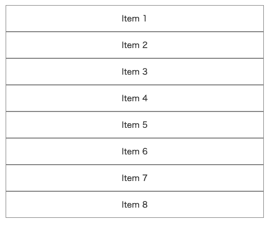
するとこのようにボーダーが重なった部分が太く見えてしまいます。
ブレークポイント 768px 未満では縦レイアウト。
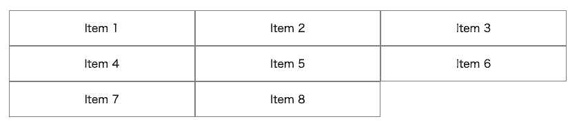
768px から横に3つ並べます。
これを解決するために `:nth-child()` で不要なボーダーを打ち消します。
> * [:nth-child() – CSS: カスケーディングスタイルシート | MDN](https://developer.mozilla.org/ja/docs/Web/CSS/:nth-child)
“`css
.c-border-fixed {
border: solid 1px gray;
@media screen and (max-width:767px) {
&:nth-child(n + 2) {
border-top-width: 0;
}
}
@media screen and (min-width:768px) {
border-left-width: 0;
&:nth-child(3n + 1) {
border-left-width: 1px;
}
&:nth-child(n + 4) {
border-top-width: 0;
}
}
}
“`
`&:nth-child(n + 2)`
2番目 [=(0)+2], 3番目 [=(1)+2], 4番目 [=(2)+2], 5番目 [=(3)+2], … 等の要素を表します。
`&:nth-child(3n + 1)`
1番目 [=(3×0)+1], 4番目 [=(3×1)+1], 7番目 [=(3×2)+1], 10番目 [=(3×3)+1], … 等の要素を表します。
`&:nth-child(n + 4)`
4番目 [=(0)+4], 5番目 [=(1)+4], 6番目 [=(2)+4], 7番目 [=(3)+4], … 等の要素を表します。
See the Pen
Responsive CSS Flexbox with border by DriftwoodJP (@DriftwoodJP)
on CodePen.
## 補遺
> * [メディアクエリの使用 – CSS: カスケーディングスタイルシート | MDN](https://developer.mozilla.org/ja/docs/Web/CSS/Media_Queries/Using_media_queries)
> * [CSSの:nth-childと:nth-last-child擬似クラスの使用例 | NxWorld](https://www.nxworld.net/tips/css-nth-child-and-nth-last-child.html)
> * [Mastering the :nth-child | CSS3 pseudo classes and :nth-child ranges](http://nthmaster.com/)