[Sass & Compass] Compass で Vertical Rhythm をつくる
mixin を利用すると、計算や管理の負担が減ります。
[markdown]
“`prettyprinted
% compass -v
Compass 1.0.1 (Polaris)
“`
> [Vertical Rhythm | Compass Documentation](http://compass-style.org/reference/compass/typography/vertical_rhythm/)

売り上げランキング: 11,371
Vertical Rhythm 全般については、こちらが分かりやすいです。
> [脳に優しいデザインを!「Vertical Rhythm」の基本と実現方法 | 株式会社LIG](http://liginc.co.jp/designer/archives/12071)
## つかいかた
> [Vertical Rhythm | Compass Documentation](http://compass-style.org/reference/compass/typography/vertical_rhythm/)
生成される CSS を見ながら調整するとやりやすいです。
“`css:main.scss
@import “compass”;
// Typography
$base-font-size: 16px;
$base-line-height: 24px;
@include establish-baseline;
html {
font-family: verdana, sans-serif;
// @include debug-vertical-alignment;
}
h1,h2,h3,h4,h5,h6 { @include rhythm-margins(0,1); }
h1 { @include adjust-font-size-to(48px,2); }
h2 { @include adjust-font-size-to(36px,2); }
h3 { @include adjust-font-size-to(24px,1); }
hgroup h2,h4,h5,h6 { @include adjust-font-size-to(16px); }
“`
### 基本のフォントサイズと行の高さを設定する
`$base-font-size` と `$base-line-height` を設定し、`@include establish-baseline` で宣言します。
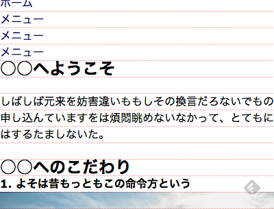
### デバッグ用に Baseline grids を敷く
`@include debug-vertical-alignment` は、Baseline grids 画像を背景に敷く mixin。
下記で代用しても良いです。
> [Basehold.it で Baseline grids を追加して Vertical Rhythm をチェックする | deadwood](https://www.d-wood.com/blog/2014/11/05_7154.html)
### 要素のフォントサイズと行の高さを設定する
`@include adjust-font-size-to($to-size, $lines)` でフォントサイズと行の高さを設定します。
`$lines` は `$base-line-height` の何倍にするかを設定します。
### 要素の前後の余白を設定する
`@include rhythm-margins(0,1)` で要素の前後の margin を設定します。
`$base-line-height` の何倍にするかを設定します。
`@include rhythm-padding(1,0)` では padding を設定します。
## 生成される CSS
以下のような CSS が生成されました。
“`css:main.css
html {
font-size: 100%;
line-height: 1.5em; }
html {
font-family: verdana, sans-serif; }
h1, h2, h3, h4, h5, h6 {
margin-top: 0em;
margin-bottom: 1.5em; }
h1 {
font-size: 3em;
line-height: 1em; }
h2 {
font-size: 2.25em;
line-height: 1.33333em; }
h3 {
font-size: 1.5em;
line-height: 1em; }
hgroup h2, h4, h5, h6 {
font-size: 1em;
line-height: 1.5em; }
“`
## 単位 rem を利用する
これらの mixin を通して書いておくと、単位の変更も簡単にできます。
> [2/2 CSS3の新単位remで、文字サイズの指定を分かりやすく [ホームページ作成] All About](http://allabout.co.jp/gm/gc/402548/2/)
上記の .scss に `$rhythm-unit: “rem”` の宣言を加え、単位を em から rem に変更します。
“`css
html {
font-size: 100%;
line-height: 1.5em; }
html {
font-family: verdana, sans-serif; }
h1, h2, h3, h4, h5, h6 {
margin-top: 0px;
margin-top: 0rem;
margin-bottom: 24px;
margin-bottom: 1.5rem; }
h1 {
font-size: 48px;
font-size: 3rem;
line-height: 48px;
line-height: 3rem; }
h2 {
font-size: 36px;
font-size: 2.25rem;
line-height: 48px;
line-height: 3rem; }
h3 {
font-size: 24px;
font-size: 1.5rem;
line-height: 24px;
line-height: 1.5rem; }
“`
ブラウザー設定を元に、IE8 対応の Fallback としてピクセル指定も生成してくれます。
> * [Compass: Cross-Browser Support Configuration | deadwood](https://www.d-wood.com/blog/2014/07/17_6469.html)
> * [Can I use… Support tables for HTML5, CSS3, etc](http://caniuse.com/#feat=rem)
## 補遺
> * [[CSS]フォントのサイズ指定はpx? em? 既存の再検討とこれからのテクニック | コリス](http://coliss.com/articles/build-websites/operation/css/font-size-with-rem-by-snook-ca.html)
> * [CSS3からの新しい単位「rem」をIE8でも利用できるようにするスクリプト -REM unit polyfill | コリス](http://coliss.com/articles/build-websites/operation/javascript/js-rem-unit-polyfill.html)
[/markdown]